WP02 – Building an Accordion Web Part with PnP SPFx React Controls
Introduction
The SharePoint Framework (SPFx) provides a modern development model for building client-side solutions in Microsoft 365. While React offers flexibility for creating user interfaces, many common components require significant effort to implement from scratch.
The PnP SPFx React Controls library simplifies this process by providing a collection of production-ready controls that integrate naturally with SharePoint Framework projects.
In this article, we will build a simple SPFx web part using the Accordion control from the PnP SPFx React Controls library. The Accordion control allows users to expand and collapse sections of content, making it useful for FAQs, documentation pages, knowledge bases, onboarding portals, and training sites.
What is the Accordion Control?
An Accordion is a user interface component that displays content inside collapsible sections.
Instead of showing all information simultaneously, users can expand only the sections they need.
Typical use cases include:
- Frequently Asked Questions (FAQ)
- Help Centers
- Training Portals
- Knowledge Bases
- Documentation Libraries
- Employee Onboarding Sites
- Governance Documentation
Benefits include:
- Better organization of information
- Reduced page clutter
- Improved user experience
- Mobile-friendly navigation
- Faster content discovery
Prerequisites
Before starting, ensure the following software is installed:
- Node.js compatible with your SPFx version
- Yeoman
- SharePoint Framework generator
- Visual Studio Code
- Access to a Microsoft 365 tenant
Creating the Web Part
Inside your existing SPFx solution execute:
yo @microsoft/sharepoint
Select the following options:
Which type of client-side component to create?WebPartWhat is your Web part name?AccordionDemoWhat is your Web part description?PnP Accordion Control Demo
Installing the PnP Controls Library
Install the React Controls package:
npm install @pnp/spfx-controls-react --savenpm install
Understanding the Component Structure
The project contains two main files:
AccordionDemo.tsx
Responsible for rendering the Accordion controls.
AccordionDemoWebPart.ts
Responsible for hosting the React component inside SharePoint.
Creating the Accordion Component
The component imports the Accordion control from the PnP library:
import { Accordion } from '@pnp/spfx-controls-react/lib/Accordion';
A sample collection of questions and answers is created:
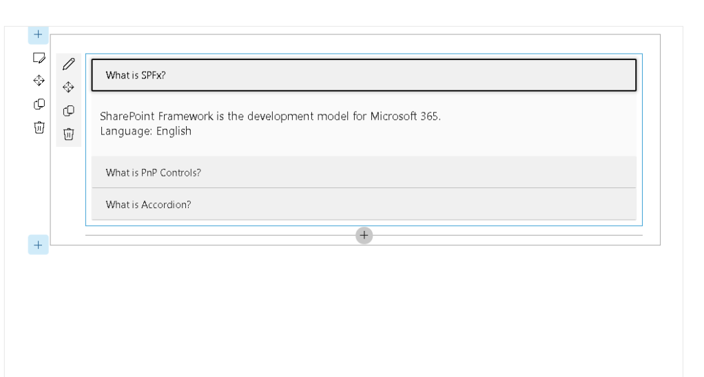
const sampleItems = [ { Question: 'What is SPFx?', Response: 'SharePoint Framework is the development model for Microsoft 365.', Language: 'English' }, { Question: 'What is PnP Controls?', Response: 'A collection of reusable React controls for SPFx.', Language: 'English' }, { Question: 'What is Accordion?', Response: 'A UI component used to expand and collapse content.', Language: 'English' }];
Each item is rendered as an independent Accordion section:
{ sampleItems.map((item, index) => ( <Accordion title={item.Question} defaultCollapsed={true} key={index} > <div> <div>{item.Response}</div> <div>{`Language: ${item.Language}`}</div> </div> </Accordion> ))}
The title becomes the clickable header while the content is displayed when expanded.
Understanding Key Properties
title
Defines the text displayed in the Accordion header.
title="What is SPFx?"
defaultCollapsed
Controls the initial state.
defaultCollapsed={true}
Possible values:
| Value | Result |
|---|---|
| true | Starts collapsed |
| false | Starts expanded |
Running the Solution
Start the development server:
heft start
Open the SharePoint Workbench:
https://yourtenant.sharepoint.com/sites/dev/_layouts/workbench.aspx
Add the AccordionDemo web part to the page.
Expected Result
Users will see three collapsible sections:
▶ What is SPFx?▶ What is PnP Controls?▶ What is Accordion?
Clicking a section expands the associated content.
Real-World Business Scenarios
Human Resources
Employee onboarding guides.
IT Support
Common troubleshooting questions.
Governance Portals
Policies and standards documentation.
Training Sites
Course modules and learning paths.
Project Management Offices
Methodologies, templates, and process documentation.
Advantages of Using PnP Controls
Building an Accordion manually requires:
- State management
- Expand/collapse logic
- Accessibility support
- Keyboard navigation
- Styling
- Testing
The PnP Accordion control provides these capabilities out of the box, reducing development time and improving consistency across solutions.
Conclusion
The Accordion control is one of the simplest yet most effective components available in the PnP SPFx React Controls library. It helps organize content, improves usability, and provides an accessible experience for SharePoint users.
By combining SPFx with PnP Controls, developers can focus on business requirements rather than rebuilding common user interface patterns from scratch.
The Accordion control is particularly valuable for FAQs, training portals, governance hubs, and knowledge management solutions, making it a practical addition to any SharePoint developer’s toolbox.
References
PnP SPFx React Controls – Accordion
SharePoint Framework Documentation
Microsoft 365 Patterns and Practices
 edvaldo b. guimarães filho