
Below is the complete English article section that highlights the real-world issue encountered during the implementation of WP04 AnimatedDialog.
WP04 – AnimatedDialog in SharePoint Framework (SPFx) Using PnP SPFx React Controls
Introduction
SharePoint Framework (SPFx) is the modern development model for Microsoft 365 and SharePoint Online. It enables developers to build client-side solutions using technologies such as TypeScript, React, and Fluent UI.
One of the major advantages of SPFx is the ability to leverage community-driven libraries that accelerate development. Among these libraries, PnP SPFx React Controls is one of the most valuable resources available to SharePoint developers.
The library contains dozens of reusable controls designed specifically for SPFx projects. These controls reduce development effort, provide a consistent user experience, and simplify the implementation of common Microsoft 365 scenarios.
In this article, we will explore the AnimatedDialog control and build a demonstration Web Part that showcases how animated dialogs can be used to improve the user experience in SharePoint Online solutions.
Understanding the AnimatedDialog Control
The AnimatedDialog control is a reusable component provided by the PnP SPFx React Controls library.
It extends the standard dialog experience by providing animated transitions when dialogs are displayed or closed.
Key benefits include:
- Improved user experience
- Smooth opening and closing animations
- Seamless integration with Fluent UI
- Reduced implementation effort
- Consistent Microsoft 365 design language
- Better visual feedback for users
Animated dialogs are commonly used for confirmations, warnings, notifications, and information display scenarios.
Typical Use Cases
The AnimatedDialog control can be used in many business scenarios:
- Document deletion confirmations
- Approval workflows
- Submission confirmations
- Error notifications
- Success messages
- Information popups
- User acknowledgments
Instead of navigating users away from the current page, dialogs allow interactions to occur directly within the current context.
Solution Architecture
The Web Part created in this example uses the following structure:
src └── webparts └── animatedDialog ├── AnimatedDialogWebPart.ts └── components ├── AnimatedDialog.tsx ├── AnimatedDialog.module.scss └── IAnimatedDialogProps.ts
Creating the Web Part
Run the SharePoint Yeoman generator:
yo @microsoft/sharepoint
Select the following options:
Which type of client-side component to create?WebPartWhat is your Web part name?AnimatedDialogWhat is your Web part description?PnP AnimatedDialog Control Demo
Installing the PnP Control Library
Install the PnP SPFx React Controls package:
npm install @pnp/spfx-controls-react --save
Install dependencies:
npm install
Start the development environment:
heft start
Defining the Component Interface
File:
IAnimatedDialogProps.ts
export interface IAnimatedDialogProps { description: string;}
Importing the AnimatedDialog Control
The official import statement is:
import { AnimatedDialog } from '@pnp/spfx-controls-react/lib/AnimatedDialog';
We also use Fluent UI components:
import { DefaultButton, DialogFooter, DialogType, PrimaryButton} from '@fluentui/react';
Real-World Issue Encountered During Development
During implementation, a significant TypeScript compatibility issue was discovered.
The project compiled successfully until the AnimatedDialog component was configured using Fluent UI type definitions.
The following error appeared:
TS2322: Type 'IDialogContentProps'is not assignable to type 'IDialogContentProps'
At first glance, the error seems impossible because it appears to assign a type to itself.
However, the root cause is related to dependency duplication.
Understanding the Problem
The project contained two separate Fluent UI installations:
node_modules/@fluentui/react
and
node_modules/@pnp/spfx-controls-react/node_modules/@fluentui/react
This creates two different versions of the same Fluent UI types.
Although the interfaces have identical names, TypeScript treats them as completely different definitions.
The dependency tree looked like this:
Web Part | +-- @fluentui/react | +-- IDialogContentPropsPnP AnimatedDialog | +-- @fluentui/react | +-- IDialogContentProps
As a result, objects created by one Fluent UI package could not be assigned to properties expecting objects from the other Fluent UI package.
Error Symptoms
The error typically appears on properties such as:
dialogContentProps={animatedDialogContentProps}
or
modalProps={animatedModalProps}
with messages similar to:
Types have separate declarations of a private property '_groupChildren'
This message is a strong indicator that multiple versions of the same dependency exist within the project.
Root Cause Analysis
Originally, the code used explicit type declarations:
const animatedDialogContentProps: IDialogContentProps = { ...};const animatedModalProps: IModalProps = { ...};
These types came from the root Fluent UI package.
However, AnimatedDialog expected equivalent types coming from its own internal Fluent UI dependency.
Even though both interfaces shared the same name, TypeScript identified them as incompatible.
Solution
The simplest solution was to remove the explicit type declarations and allow TypeScript to infer the object structure automatically.
Instead of:
const animatedDialogContentProps: IDialogContentProps = { ...};const animatedModalProps: IModalProps = { ...};
we used:
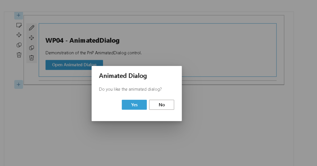
const animatedDialogContentProps = { type: DialogType.normal, title: 'Animated Dialog', subText: 'Do you like the animated dialog?'};const animatedModalProps = { isDarkOverlay: true};
By removing the explicit type annotations, TypeScript successfully inferred compatible types and the build completed without errors.
Troubleshooting Recommendations
When working with SPFx projects, it is a good practice to verify installed Fluent UI versions.
Check Fluent UI dependencies:
npm list @fluentui/react
Check the installed PnP package version:
npm list @pnp/spfx-controls-react
Whenever you encounter errors such as:
Type X is not assignable to type X
or
Types have separate declarations
the first thing to investigate is whether multiple versions of the same dependency exist in the project.
Lessons Learned
This issue demonstrates a common challenge in modern SPFx development.
Many third-party libraries include their own dependency trees, which can introduce duplicate type definitions.
Understanding how TypeScript resolves types across nested dependencies is essential when troubleshooting complex SharePoint Framework projects.
This experience also highlights the importance of testing PnP examples against the specific SPFx version being used in a project.
Conclusion
The AnimatedDialog control provides an elegant and user-friendly way to display modal dialogs in SharePoint Framework solutions.
While implementing the control, we encountered a real-world dependency conflict involving Fluent UI type definitions. Resolving this issue provided valuable insight into how SPFx, TypeScript, Fluent UI, and PnP controls interact behind the scenes.
This kind of troubleshooting experience is often more valuable than the control implementation itself because it prepares developers for challenges commonly encountered in enterprise SharePoint projects.
The completed WP04 example not only demonstrates the AnimatedDialog control but also documents a practical solution to a dependency conflict that many SPFx developers may face in modern environments.
Roadmap Progress
| WP | Control | Status |
|---|---|---|
| WP01 | AccessibleAccordion | Complete |
| WP02 | Accordion | Complete |
| WP03 | AdaptiveCardHost | Complete |
| WP04 | AnimatedDialog | Complete |
| WP05 | Carousel | Pending |
| WP06 | ChartControl | Pending |
| WP07 | Dashboard | Pending |
| WP08 | DragDropFiles | Pending |
Completed: 4 of 76 controls.
 edvaldo b. guimarães filho