WP07 – Dashboard Control in SharePoint Framework (SPFx)
Introduction to SharePoint Framework (SPFx)
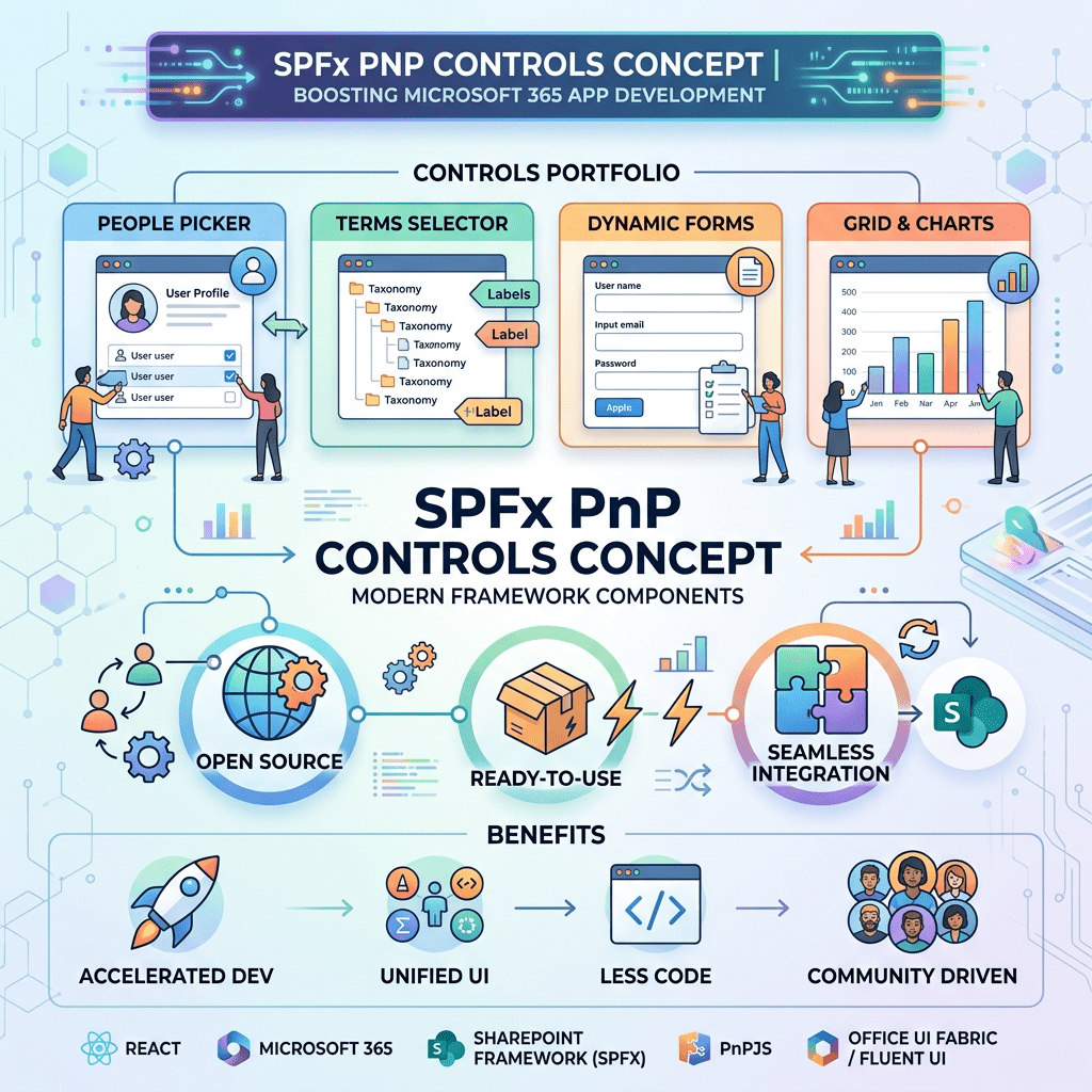
SharePoint Framework (SPFx) is the modern development model for Microsoft SharePoint Online and Microsoft 365. It enables developers to create client-side web parts and extensions using technologies such as TypeScript, React, Fluent UI, and modern JavaScript.
One of the greatest advantages of SPFx is its ability to integrate seamlessly with Microsoft 365 services while providing a modern development experience based on reusable components.
To accelerate development, Microsoft 365 developers commonly use the PnP SPFx React Controls library. This open-source project provides dozens of ready-to-use controls that simplify the implementation of complex SharePoint solutions.
Official documentation:
Understanding the Dashboard Control
The Dashboard control allows developers to organize information inside configurable widgets.
A widget may contain:
- A title
- A description
- Action menus
- Multiple tabs
- Links
- Custom React content
The control is particularly useful when building:
- SharePoint intranet home pages
- Team dashboards
- Information portals
- Department landing pages
- Project overview pages
It is important to understand that the Dashboard control is not an analytical dashboard like Power BI. Instead, it acts as a container for organizing content inside reusable cards.
Official documentation:
Project Structure
For this demonstration, the standard SPFx component generated by Yeoman was preserved.
Instead of modifying the generated component, a new React component called DashboardEd.tsx was created.
Project structure:
src└── webparts └── dashBoardCorrigido ├── DashBoardCorrigidoWebPart.ts └── components ├── DashBoardCorrigido.tsx ├── DashboardEd.tsx └── IDashBoardCorrigidoProps.ts
The custom Dashboard implementation lives entirely inside DashboardEd.tsx.
Modifying the Web Part
The original Web Part rendered the default component:
React.createElement( DashBoardCorrigido, {});
This was replaced by:
React.createElement( DashboardEd, {});
The Web Part now acts only as a host.
Architecture:
DashBoardCorrigidoWebPart │ ▼ DashboardEd │ ▼ PnP Dashboard
This approach keeps the Yeoman-generated code intact while allowing complete freedom to experiment with the Dashboard control.
DashboardEd Component
The component starts by importing React, the Dashboard control, and Fluent UI controls.
import * as React from 'react';import { WidgetSize, Dashboard} from '@pnp/spfx-controls-react/lib/Dashboard';import { Icon, Text} from '@fluentui/react';
The Dashboard control is provided by the PnP React Controls library.
The Icon and Text components come from Fluent UI.
Creating Widget Actions
The first custom element created is the action menu.
const calloutItemsExample = [ { id: "action_1", title: "Info", icon: <Icon iconName={'Edit'} />, }, { id: "action_2", title: "Popup", icon: <Icon iconName={'Add'} />, },];
These actions appear in the widget menu represented by the three-dot button.
Result:
... ├─ Info └─ Popup
This feature allows developers to provide commands associated with each widget.
Creating Widget Tabs
The first widget contains three tabs.
body: [ { id: "t1", title: "Tab 1", content: ( <Text> Content #1 </Text> ), }, { id: "t2", title: "Tab 2", content: ( <Text> Content #2 </Text> ), }, { id: "t3", title: "Tab 3", content: ( <Text> Content #3 </Text> ), },]
Each object inside the body collection becomes a tab.
The title property defines the tab caption.
The content property defines the React content rendered when the tab is selected.
Creating the First Widget
The first card uses the Triple size.
{ title: "Card 1", desc: "Last updated Monday, April 4 at 11:15 AM (PT)", widgetActionGroup: calloutItemsExample, size: WidgetSize.Triple, body: [...]}
Properties:
| Property | Purpose |
|---|---|
| title | Widget title |
| desc | Widget description |
| widgetActionGroup | Action menu |
| size | Widget width |
| body | Tabs and content |
The Triple size makes the widget occupy a larger area than the other cards.
Creating Additional Widgets
The second widget:
{ title: "Card 2", size: WidgetSize.Single}
The third widget:
{ title: "Card 3", size: WidgetSize.Double}
These widgets demonstrate how different Dashboard layouts can be created using different widget sizes.
Available sizes include:
WidgetSize.SingleWidgetSize.DoubleWidgetSize.Triple
Rendering the Dashboard
Finally, the Dashboard component is rendered.
return ( <Dashboard widgets={[ ... ]} />);
The widgets collection is passed to the Dashboard control.
The control automatically generates the layout, tabs, menus, and navigation elements.
Result
The final solution displays:
- Three dashboard cards
- Multiple widget sizes
- Action menus
- Three tabs
- Fluent UI integration
- Custom React content
The Dashboard automatically handles layout and user interaction.
Why Use the Dashboard Control?
Benefits include:
- Faster development
- Consistent user experience
- Fluent UI integration
- Responsive layout
- Reusable widget structure
- Reduced custom code
For SharePoint portal solutions, this control provides an efficient way to organize information without creating a custom layout engine.
Conclusion
In this example we explored the Dashboard control from the PnP SPFx React Controls library.
Rather than modifying the component generated by the SPFx Yeoman template, a separate DashboardEd.tsx component was created and rendered by the Web Part. This approach keeps the generated code intact and simplifies experimentation.
The Dashboard control offers a practical solution for organizing information into widgets, tabs, and actions while maintaining full compatibility with React and Fluent UI.
For SharePoint developers building modern portals and landing pages, it is an excellent option for creating structured information dashboards with minimal code.
 edvaldo b. guimarães filho