SPFx FilePicker Control with PnP React Controls
The FilePicker control from the PnP SPFx React Controls library is one of the most practical controls for real-world SharePoint Framework solutions. It allows users to browse and select files from multiple Microsoft 365 sources without the developer needing to manually build upload dialogs, connect to document libraries, or implement file source switching.
Official documentation:
PnP FilePicker Official Documentation
In the roadmap, this is:
| Web Part | Control |
|---|---|
| WP18 | FilePicker |
Why FilePicker is important in SPFx
In modern SharePoint development, content is everywhere:
- SharePoint libraries
- OneDrive
- Microsoft Teams files
- Recent files
- Stock images
- Direct uploads
- External URLs
Without FilePicker, you would need:
- Custom dialogs
- Graph API integration
- Upload endpoints
- File validation logic
- Source management
The FilePicker control abstracts all of this.
It gives the user a native Microsoft 365 file selection experience.
This makes your SPFx solution:
- faster to build
- easier to maintain
- consistent with Microsoft UI patterns
- more user-friendly
What this example does
Our example:
- opens the FilePicker dialog
- allows selecting files
- returns file metadata
- logs everything in the console
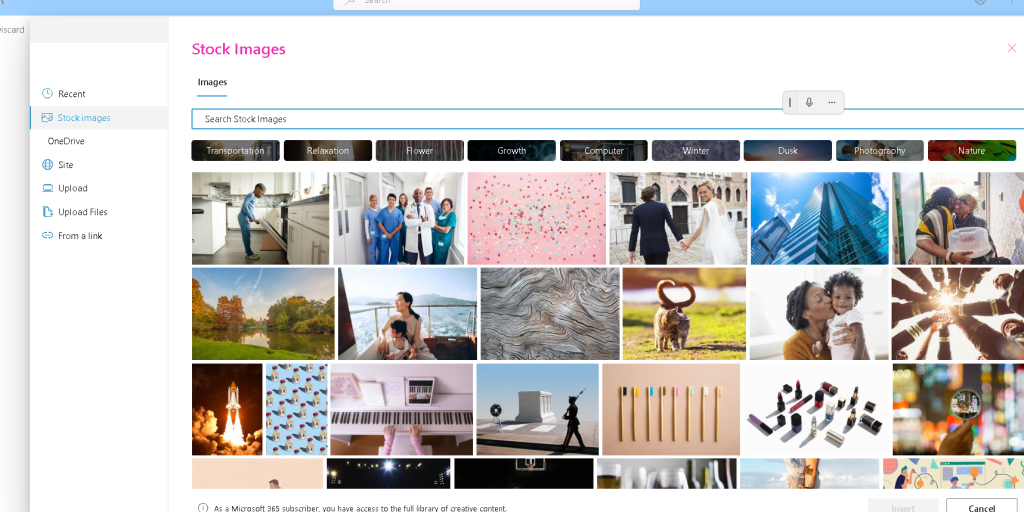
The user can choose from:
- Recent
- Stock images
- OneDrive
- Site
- Upload
- Upload files
- From a link
Exactly like your screenshot.
Installing the control
Inside your SPFx solution:
npm install @pnp/spfx-controls-react --savenpm install
Then start:
heft start
Understanding the Web Part
Your web part is responsible for:
- bootstrapping the React component
- passing the SharePoint context
The important part:
public render(): void { const element: React.ReactElement<IFilePickerCtrProps> = React.createElement( FilePickerCtr, { context: this.context } ); ReactDom.render(element, this.domElement);}
Explanation
React.createElement
Creates the React component.
FilePickerCtr
This is the component where the FilePicker lives.
context: this.context
This is essential.
The FilePicker needs SPFx context to:
- access site libraries
- access OneDrive
- authenticate with Microsoft 365
- load recent files
Without context:
<FilePicker />
will fail.
Props interface
IFilePickerCtrProps.ts
export interface IFilePickerCtrProps { context: any;}
Explanation
This interface defines what the component expects.
We pass:
context
from the Web Part.
In production, you should use:
WebPartContext
instead of any.
Example:
import { WebPartContext } from '@microsoft/sp-webpart-base';export interface IFilePickerCtrProps { context: WebPartContext;}
This gives better TypeScript safety.
Main component
FilePickerCtr.tsx
import * as React from 'react'import { useState } from 'react';import { FilePicker, IFilePickerResult } from '@pnp/spfx-controls-react/lib/FilePicker';interface IFilePickerCtrProps {context:any}const FilePickerCtr:React.FC<IFilePickerCtrProps>=({context})=>{const [filePickerResult, setState] = useState<IFilePickerResult[]>([]);return(<FilePicker accepts= {[".gif", ".jpg", ".jpeg", ".bmp", ".dib", ".tif", ".tiff", ".ico", ".png", ".jxr", ".svg"]} buttonIcon="FileImage" onSave={(filePickerResult: IFilePickerResult[]) => { setState(filePickerResult) }} onChange={(filePickerResult: IFilePickerResult[]) => { setState(filePickerResult) }} context={context}/>)}export default FilePickerCtr;
Breaking down the code
Importing React
import * as React from 'react';
Standard React import.
Needed for JSX.
Importing FilePicker
import { FilePicker, IFilePickerResult} from '@pnp/spfx-controls-react/lib/FilePicker';
Two important imports:
FilePicker
The actual UI component.
It renders:
- button
- dialog
- tabs
- file browser
IFilePickerResult
Represents selected files.
Contains useful metadata:
- fileName
- fileAbsoluteUrl
- spItemUrl
- downloadFileContent()
- fileSize
- iconFileType
This is extremely useful.
Receiving context
const FilePickerCtr: React.FC<IFilePickerCtrProps> = ({ context }) =>
The component receives SharePoint context from the web part.
This enables internal authentication.
onSave event
const onSave = (filePickerResult: IFilePickerResult[]): void =>
Triggered when the user clicks:
Select
This returns an array because multi-selection is supported.
Example output:
[ { "fileName": "Document.pdf", "fileAbsoluteUrl": "https://tenant.sharepoint.com/sites/demo/Shared Documents/Document.pdf" }]
Inside:
console.log(filePickerResult);
Shows raw objects.
And:
JSON.stringify(filePickerResult, null, 2)
Formats them nicely.
onCancel event
const onCancel = (): void =>
Runs when the user closes the picker.
Useful for:
- analytics
- logging
- resetting state
Rendering the control
<FilePicker context={context} buttonLabel="Select file" onSave={onSave} onCancel={onCancel}/>
This is the entire control.
context
Required.
buttonLabel
Changes the button text.
Default:
Select file
onSave
Handles file selection.
onCancel
Handles cancel.
What happens at runtime
Step by step:
User clicks button
↓
FilePicker dialog opens
↓
User selects source:
- Recent
- OneDrive
- Site
- Upload
↓
User selects file
↓
Clicks Save
↓
onSave() fires
↓
Returns IFilePickerResult[]
↓
You can:
- store URL
- save to list
- display image
- attach to item
- download content
Real-world use cases
Document library selector
Allow users to choose templates.
Image gallery
Pick images from Stock Images or Site Assets.
Employee profile photo selector
Connect to profile images.
Dynamic banner system
Store selected image URL in a SharePoint list.
File attachment system
Use selected files in forms.
Advanced example — getting file content
You can download file content:
const onSave = async (files: IFilePickerResult[]) => { const content = await files[0].downloadFileContent(); console.log(content);};
This is powerful.
You get the Blob directly.
Useful for:
- previews
- uploads
- transformations
Best practices
Always:
✅ Pass WebPartContext
✅ Validate file type
✅ Limit extensions when needed
✅ Handle cancel event
✅ Store URLs instead of full files when possible
Final thoughts
FilePicker is one of the most useful controls in the PnP SPFx library because it solves a very common problem:
How do users select files from Microsoft 365?
Instead of building everything manually, you get:
- Microsoft-native experience
- multi-source selection
- uploads
- metadata
- file content access
For enterprise SPFx development, this is almost mandatory.
It saves hours of development and gives users a familiar UI.
 edvaldo b. guimarães filho