The FolderPicker control from PnP SPFx React Controls allows users to browse SharePoint folders and select one folder from a document library structure. According to the official documentation, this control can explore and select folders, and it can also allow users to create a new folder at the current explored level. (PnP GitHub)
SPFx FolderPicker Control — PnP React Controls
Official documentation: https://pnp.github.io/sp-dev-fx-controls-react/controls/FolderPicker/
Introduction
The FolderPicker control from PnP SPFx React Controls allows users to browse SharePoint folders and select one folder from a document library structure. According to the official documentation, this control can explore and select folders, and it can also allow users to create a new folder at the current explored level. (PnP GitHub)
This is useful when a SharePoint Framework web part needs a folder location selected by the user. For example, a web part may need to know where files should be uploaded, where documents should be stored, or which folder should be used as a source for another operation.
Installation
Inside your existing SPFx solution, install the PnP React Controls package:
npm install @pnp/spfx-controls-react --save
Then install dependencies and start the local workbench:
npm installheft start
Component Props Interface
Create or update:
// IFolderPickerWpProps.tsimport { WebPartContext } from "@microsoft/sp-webpart-base";export interface IFolderPickerWpProps { context: WebPartContext;}
Complete React Component
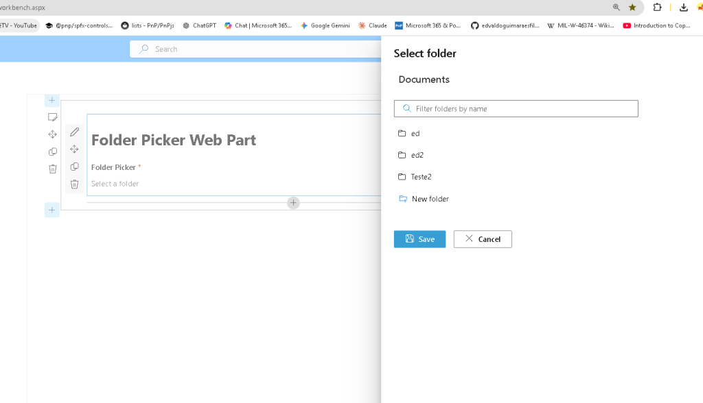
import * as React from 'react';import { FolderPicker, IFolder } from "@pnp/spfx-controls-react/lib/FolderPicker";import { IFolderPickerWpProps } from './IFolderPickerWpProps';const _onFolderSelect = (folder: IFolder): void => { console.log('selected folder', folder);}const FolderPickerWp: React.FC<IFolderPickerWpProps> = (props) => { return ( <div> <h1>Folder Picker Web Part</h1> <FolderPicker context={props.context} label='Folder Picker' required={true} rootFolder={{ Name: 'Documents', ServerRelativeUrl: `/sites/dev/Shared Documents` }} onSelect={_onFolderSelect} canCreateFolders={true} /> </div> );};export default FolderPickerWp;
Code Explanation
The import below brings the PnP control and the folder type used by the selection event:
import { FolderPicker, IFolder } from "@pnp/spfx-controls-react/lib/FolderPicker";
The IFolder interface represents the folder selected by the user. In this example, the selected folder is written to the browser console:
const _onFolderSelect = (folder: IFolder): void => { console.log('selected folder', folder);}
The context property is required because the control needs the SPFx context to communicate with SharePoint:
<FolderPicker context={props.context}
The label property defines the text shown above the picker:
label='Folder Picker'
The required property marks the folder selection as mandatory:
required={true}
The rootFolder property defines the starting folder for navigation:
rootFolder={{ Name: 'Documents', ServerRelativeUrl: `/sites/dev/Shared Documents`}}
In this sample, the picker starts in the Documents library of the /sites/dev site.
The onSelect property receives the callback executed when the user selects a folder:
onSelect={_onFolderSelect}
The canCreateFolders property enables folder creation from the picker UI:
canCreateFolders={true}
Web Part Render Example
In the main web part file, pass the SPFx context to the React component:
public render(): void { const element: React.ReactElement<IFolderPickerWpProps> = React.createElement( FolderPickerWp, { context: this.context } ); ReactDom.render(element, this.domElement);}
Why This Control Matters
Without the FolderPicker, a developer would need to manually build folder navigation, folder selection, SharePoint REST or PnP calls, UI state, validation, and folder creation logic. The PnP control reduces this effort and provides a reusable SharePoint-aware experience.
This is especially valuable in SPFx solutions where users need to choose a document library folder instead of typing paths manually. It reduces errors and improves usability.
Important Note
The ServerRelativeUrl must match your SharePoint site and library structure. For example:
ServerRelativeUrl: `/sites/dev/Shared Documents`
If your site or library is different, update this value before testing.
Conclusion
The FolderPicker control is a practical PnP SPFx React Control for scenarios where the user must select a SharePoint folder. It integrates with the SPFx context, supports required selection, starts from a configured root folder, exposes the selected folder through onSelect, and can optionally allow users to create folders directly from the control.
 edvaldo b. guimarães filho