
SPFx IconPicker with PnP React Controls
The SharePoint Framework ecosystem allows developers to build reusable client-side web parts for modern SharePoint. In many enterprise scenarios, users or administrators need to select icons dynamically — for navigation, dashboards, cards, menus, or branding elements.
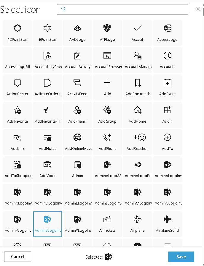
The PnP SPFx React Controls IconPicker control solves this by exposing the full Fluent UI icon library in a searchable picker.
Official documentation:
PnP IconPicker Documentation
Why use IconPicker?
Without IconPicker:
- You must manually know the Fluent UI icon names.
- Mistyped names break rendering.
- End users cannot customize visuals.
With IconPicker:
- Searchable icon catalog.
- Visual selection.
- Better UX for configurable web parts.
- Easy integration with property panes or runtime forms.
This is particularly useful for:
- Navigation menus
- Dashboard cards
- Quick links
- Status indicators
- Category labels
Installing the control
Inside your SPFx solution:
npm install @pnp/spfx-controls-react --savenpm installheft start
Full Example
Your example is correct and follows the official pattern.
IconPickerWp.tsx
import * as React from 'react';import { useState } from 'react';import { IconPicker } from '@pnp/spfx-controls-react/lib/IconPicker';const IconPickerWp: React.FC = () => { const [icon, setIcon] = useState<string>(''); return ( <div> <IconPicker buttonLabel={'Icon'} onChange={(iconName: string) => { setIcon(iconName); }} onSave={(iconName: string) => { setIcon(iconName); }} /> <div style={{ marginTop: 20 }}> Selected icon: {icon} </div> </div> );};export default IconPickerWp;
Code Explanation
Imports
import { IconPicker } from '@pnp/spfx-controls-react/lib/IconPicker';
Imports the official PnP control.
State management
const [icon, setIcon] = useState<string>('');
Stores the selected icon name.
Example:
HomeMailCalendarPeopleSettings
Button label
buttonLabel={'Icon'}
Defines the text displayed on the picker button.
onChange event
onChange={(iconName: string) => { setIcon(iconName); }}
Triggered whenever the user selects an icon.
Useful for live preview.
onSave event
onSave={(iconName: string) => { setIcon(iconName); }}
Triggered when selection is confirmed.
This is ideal for persistence.
Execution flow
User clicks button ↓Picker dialog opens ↓Searches icon ↓Selects icon ↓onChange fires ↓onSave fires ↓State updated ↓UI re-renders
That is standard React reactive rendering.
Practical enterprise use case
Imagine building a configurable company dashboard:
HR → People iconFinance → Money iconProjects → Folder iconReports → Chart icon
Instead of hardcoding:
iconName="Money"
You allow users to choose dynamically.
This makes your web part reusable across departments.
Rendering selected icon
To render the selected icon:
import { Icon } from '@fluentui/react';<Icon iconName={icon} />
Example:
<div> <Icon iconName={icon} /></div>
This turns the selected string into a real Fluent UI icon.
Benefits
| Benefit | Description |
|---|---|
| Visual selection | Easier than typing |
| Error reduction | Avoid invalid icon names |
| Better UX | Searchable picker |
| Reusable | Works in many scenarios |
| Fluent UI integration | Native compatibility |
Architecture
SPFx Web Part ↓React Component ↓PnP IconPicker ↓Fluent UI Icons ↓User Selection
Roadmap Progress
| WP | Control | Status |
|---|---|---|
| WP01 | AccessibleAccordion | ✅ |
| WP02 | Accordion | ✅ |
| WP03 | AdaptiveCardHost | ✅ |
| WP04 | AnimatedDialog | ⬜ |
| WP05 | Carousel | ⬜ |
| WP06 | ChartControl | ✅ |
| WP07 | Dashboard | ✅ |
| WP08 | DragDropFiles | ✅ |
| WP09 | EnhancedThemeProvider | ✅ |
| WP10 | FieldCollectionData | ✅ |
| WP11 | IconPicker | ✅ |
 edvaldo b. guimarães filho