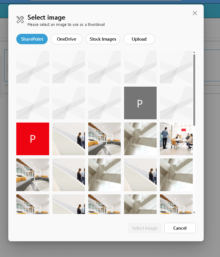
The ImagePicker enables users to select, upload, preview, and remove images directly within a web part. When combined with React Functional Components (React.FC) and hooks, it becomes even more efficient and maintainable.
Here is a detailed, blog-ready article in English based on your code and the official PnP reference:
Implementing the PnP ImagePicker in SPFx Using React Functional Components
Introduction
In modern SharePoint Framework (SPFx) development, leveraging reusable UI controls can significantly improve productivity and user experience. One of the most useful controls provided by the PnP SPFx React Controls library is the ImagePicker.
The ImagePicker enables users to select, upload, preview, and remove images directly within a web part. When combined with React Functional Components (React.FC) and hooks, it becomes even more efficient and maintainable.
In this article, we will walk through a complete working example of the ImagePicker, explain how it works, and highlight key improvements and best practices.
The Complete Code Example
Below is the implementation of the ImagePicker using a functional React component:
import * as React from “react”;
import { useState, useCallback } from “react”;
import { ImagePicker } from “@pnp/spfx-controls-react/lib/ImagePicker”;
import { IImagePickerWpProps } from “./IImagePickerWpProps”;
const ImagePickerWp: React.FC<IImagePickerWpProps> = (props) => {
const [selectedFileUrl, setSelectedFileUrl] = useState<string>(“”);
const handleFileSelected = useCallback(async (file: any) => {
console.log(“file”, file);
if (file?.fileAbsoluteUrl) {
setSelectedFileUrl(file.fileAbsoluteUrl);
}
}, []);
const onDeleteFile = useCallback(async () => {
console.log(“onDeleteFile”);
setSelectedFileUrl(“undefined”);
}, []);
return (
<ImagePicker
onFileSelected={handleFileSelected}
onDeleteFile={onDeleteFile}
selectedFileUrl={selectedFileUrl}
context={props.context}
/>
);
};
export default ImagePickerWp;
Understanding the ImagePicker Control
The ImagePicker is part of the PnP SPFx controls library and provides a ready-to-use interface for image handling. According to the official documentation, it supports selecting images from SharePoint, uploading new ones, and previewing them directly in the UI.
Reference:
https://pnp.github.io/sp-dev-fx-controls-react/controls/ImagePicker/
Step-by-Step Code Breakdown
1. Using React Hooks for State Management
The component uses the useState hook to store the selected image URL:
const [selectedFileUrl, setSelectedFileUrl] = useState<string>(“”);
Why this is important:
- The ImagePicker expects a string value
- An empty string ensures no runtime type errors
- The component re-renders automatically when the state changes
2. Handling Image Selection
The onFileSelected callback is triggered when a user selects or uploads an image:
const handleFileSelected = useCallback(async (file: any) => {
console.log(“file”, file);
if (file?.fileAbsoluteUrl) {
setSelectedFileUrl(file.fileAbsoluteUrl);
}
}, []);
“
Key points:
- The
fileobject comes from the ImagePicker fileAbsoluteUrlcontains the full URL of the selected image- The state is updated only if the URL exists
3. Handling Image Deletion
The onDeleteFile callback is triggered when the user removes the image:
const onDeleteFile = useCallback(async () => {
console.log(“onDeleteFile”);
setSelectedFileUrl(“undefined”);
}, []);
Important observation:
- This line contains a logical mistake
"undefined"is a string, not a real empty value
Correct approach would be:
setSelectedFileUrl(“”);
Otherwise:
- The component may try to load an invalid image URL
- The UI can behave unexpectedly
4. Binding the Control
The ImagePicker is connected to the component state through props:
<ImagePicker
onFileSelected={handleFileSelected}
onDeleteFile={onDeleteFile}
selectedFileUrl={selectedFileUrl}
context={props.context}
/>
Explanation of properties:
| Property | Description |
|---|---|
onFileSelected | Triggered when an image is selected |
onDeleteFile | Triggered when the image is removed |
selectedFileUrl | Current image URL displayed |
context | Required SPFx context |
Key Issue Identified
One critical issue in the code is:
setSelectedFileUrl(“undefined”);
This should be corrected to:
setSelectedFileUrl(“”);
Why This Matters
"undefined"is interpreted as a literal string- The browser will try to load a non-existent resource
- This leads to broken UI or console errors
Best Practices for Using ImagePicker
Always Use a Default String
The control requires a string:
useState<string>(“”)
Avoid:
string | undefined
Validate the File Object
Always check the existence of the URL:
if (file?.fileAbsoluteUrl)
Use useCallback for Performance
Wrapping handlers in useCallback:
- Prevents unnecessary re-renders
- Improves performance in larger SPFx solutions
Avoid Magic Strings
Instead of:
“undefined”
Use:
“”
Possible Enhancements
This implementation can be extended in real-world scenarios:
1. Persist the Image in Web Part Properties
You can store the image URL in the property pane:
props.onPropertyChange(selectedFileUrl);
2. Upload to a SharePoint Document Library
Instead of just selecting, you can:
- Automatically upload the image
- Store metadata
- Reuse across components
3. Add Default Preview
const [selectedFileUrl, setSelectedFileUrl] = useState<string>(
“https://via.placeholder.com/300“
);
“
Conclusion
The PnP ImagePicker control is a powerful addition to SPFx solutions, simplifying image selection and management. When combined with React Functional Components and hooks, it provides a clean, modern, and maintainable implementation.
By properly managing state, validating inputs, and avoiding common pitfalls like incorrect default values, you can build a robust image selection experience inside SharePoint.
This pattern is highly recommended for developers aiming to modernize SPFx solutions and follow current React best practices.
 edvaldo b. guimarães filho