SPFx ListItemPicker Control: Selecting SharePoint List Items in a Web Part
The ListItemPicker control from @pnp/spfx-controls-react is used in SharePoint Framework solutions when the user needs to search and select one or more items from an existing SharePoint list. It suggests items based on a configured list column and can be filtered, ordered, and limited. (PNP GitHub)
This fits our SharePoint Online learning path because it is an atomic SPFx app focused on one real corporate need: selecting controlled list data instead of typing free text. This follows the project principle of building small reusable apps for SharePoint Online, with governance, reuse, and Microsoft 365 alignment.
Scenario
Imagine a corporate maintenance request form where the user must select an asset, such as:
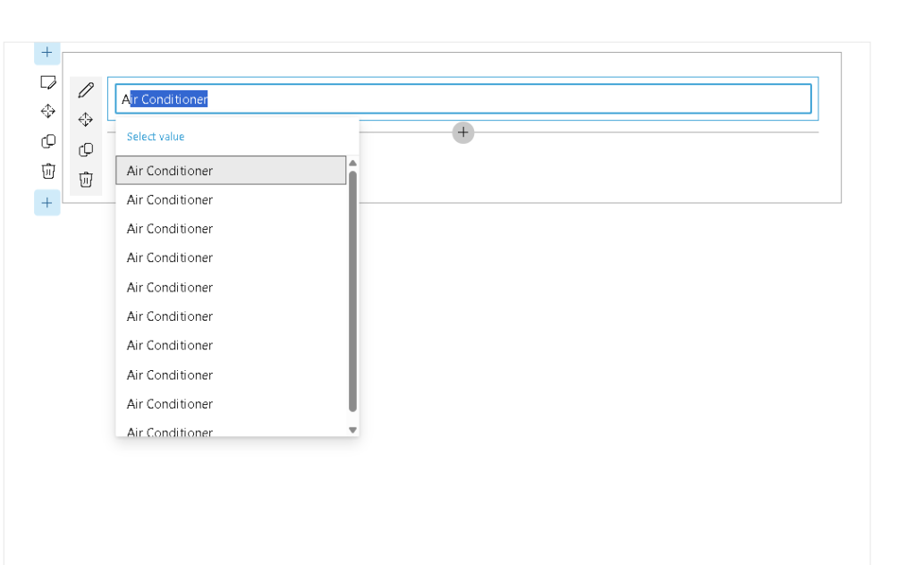
Air ConditionerPrinterProjectorLaptopMeeting Room
Instead of allowing the user to type the asset name manually, the web part reads valid values from a SharePoint list and lets the user select the correct item.
Complete Component Code
import * as React from 'react';import { ListItemPicker } from '@pnp/spfx-controls-react/lib/ListItemPicker';import { IListItemPickerWpProps } from './IListItemPickerWpProps';const onSelectedItem = (data: { key: string; name: string }[]) => { for (const item of data) { console.log(`Item value: ${item.key}`); console.log(`Item text: ${item.name}`); }};const ListItempickerWp: React.FC<IListItemPickerWpProps> = ({ context }) => { return ( <ListItemPicker listId='ab7a0321-e395-40c5-89d5-fad2b68fc6cd' columnInternalName='Title' keyColumnInternalName='Id' filter="Title eq 'Air Conditioner'" orderBy={"Id desc"} itemLimit={30} onSelectedItem={onSelectedItem} context={context} /> );};export default ListItempickerWp;
What This Web Part Does
This component renders a picker connected to a SharePoint list. The user types into the picker, and the control searches list items using the configured display column.
In this example, the picker reads from the list whose GUID is:
ab7a0321-e395-40c5-89d5-fad2b68fc6cd
It displays the value from the Title column, but internally stores the selected item using the Id column.
Props Explained
listId
listId='ab7a0321-e395-40c5-89d5-fad2b68fc6cd'
This is the GUID of the SharePoint list used as the data source.
In production, avoid hardcoding this when possible. A better approach is to expose the list ID in the property pane or resolve the list dynamically by title.
columnInternalName
columnInternalName='Title'
This defines which column is displayed to the user.
Here, the picker shows the value stored in the SharePoint Title column.
keyColumnInternalName
keyColumnInternalName='Id'
This defines the internal value returned by the picker.
In this example:
key = SharePoint item IDname = SharePoint item Title
That is why the callback prints:
console.log(`Item value: ${item.key}`);console.log(`Item text: ${item.name}`);
filter
filter="Title eq 'Air Conditioner'"
This applies an OData filter to restrict the available items.
In this case, only items whose Title is exactly Air Conditioner are returned.
For a broader picker, remove the filter:
filter=""
Or use a business filter, for example:
filter="Status eq 'Active'"
orderBy
orderBy={"Id desc"}
This orders the returned items by ID in descending order.
Useful examples:
orderBy="Title asc"orderBy="Created desc"orderBy="Modified desc"
itemLimit
itemLimit={30}
This limits the number of items returned by the picker.
This is important for performance. Avoid returning too many items, especially in large SharePoint lists.
onSelectedItem
onSelectedItem={onSelectedItem}
This callback runs when the user selects an item.
The returned object has this structure:
{ key: string; name: string;}
So, if the selected SharePoint item is:
Id: 12Title: Air Conditioner
The callback receives approximately:
{ key: "12", name: "Air Conditioner"}
context
context={context}
The SPFx context gives the control access to the current SharePoint site, page, user context, HTTP clients, and environment information. SPFx web parts run in the context of SharePoint pages and are the supported model for modern SharePoint client-side customization. (Microsoft Learn)
Props Interface Example
Your IListItemPickerWpProps.ts should include the SPFx context:
import { WebPartContext } from '@microsoft/sp-webpart-base';export interface IListItemPickerWpProps { context: WebPartContext;}
Web Part Render Example
In the main web part file, pass the context to the React component:
public render(): void { const element: React.ReactElement<IListItemPickerWpProps> = React.createElement(ListItempickerWp, { context: this.context }); ReactDom.render(element, this.domElement);}
Production Notes
For a real SharePoint Online solution, this control is useful when you need to select controlled data from a list, such as assets, departments, cost centers, document categories, projects, or training names.
Recommended improvements:
Use the property pane to configure the list ID.Use indexed columns when filtering large lists.Use business filters such as Status eq 'Active'.Store the selected key, not only the display text.Validate empty selections before submitting data.
Conclusion
ListItemPicker is a practical SPFx control for connecting a web part to SharePoint list data. It avoids manual text entry, improves data quality, and creates a better user experience when users need to select existing SharePoint items.
It is a good atomic app because it solves one specific problem: selecting a valid SharePoint list item inside a modern SPFx web part.
 edvaldo b. guimarães filho