SPFx Basic ListView Kit: Reading SharePoint List Items with PnPjs and Rendering Them with PnP ListView
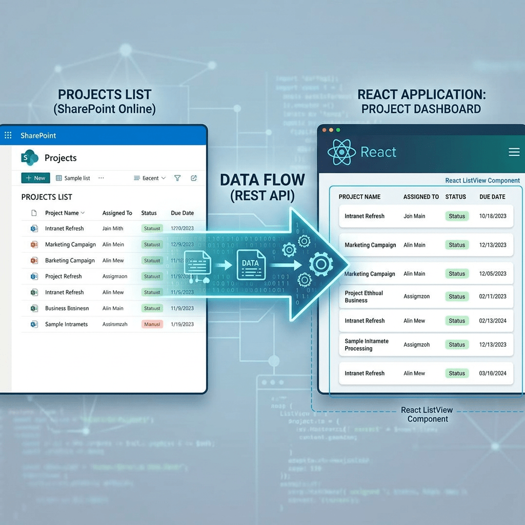
When building SharePoint Framework solutions, one of the most common requirements is to read data from a SharePoint list and display it in a clean, reusable, and user-friendly interface.
This article introduces a simple but important pattern that I like to call the SPFx Basic ListView Kit.
The idea is straightforward:
- Use PnPjs to get SharePoint list items.
- Store the result in React state.
- Use the PnP SPFx ListView control to render the data.
- Keep the component small, reusable, and ready to evolve.
Official documentation:
- PnPjs SharePoint Items: https://pnp.github.io/pnpjs/sp/items/
- PnP SPFx ListView Control: https://pnp.github.io/sp-dev-fx-controls-react/controls/ListView/
Why This Example Matters
This example is small, but it represents a very important SPFx development pattern.
In real corporate solutions, many web parts follow this same structure:
SharePoint List ↓PnPjs Query ↓React State ↓PnP ListView ↓User Interface
This is a solid foundation for dashboards, document views, approval lists, task lists, training trackers, operational panels, and many other SharePoint Online solutions.
Instead of manually creating an HTML table, this approach uses the ready-made ListView control from PnP SPFx React Controls. That gives us filtering, selection, sorting configuration, compact mode, and a consistent SharePoint-like user experience.
The Full Component
import * as React from 'react';import { ISpBasicoListViewProps } from './ISpBasicoListViewProps';import { getSP } from "../../commom/pnpjsConfig";import { useEffect, useState } from "react";import { ListView, IViewField, SelectionMode} from "@pnp/spfx-controls-react/lib/ListView";interface IListItem { Id: number; Title: string; Modified: string; Created: string;}const SpBasicoListView: React.FC<ISpBasicoListViewProps> = (props) => { const [items, setItems] = useState<IListItem[]>([]); const [loading, setLoading] = useState<boolean>(true); const viewFields: IViewField[] = [ { name: "Id", displayName: "ID", sorting: true, minWidth: 50, maxWidth: 80 }, { name: "Title", displayName: "Title", sorting: true, minWidth: 150 }, { name: "Created", displayName: "Created", sorting: true, minWidth: 150 }, { name: "Modified", displayName: "Modified", sorting: true, minWidth: 150 } ]; useEffect(() => { loadItems(); }, []); const loadItems = async (): Promise<void> => { try { const sp = getSP(props.context); const result: IListItem[] = await sp.web.lists .getByTitle("Documents") .items .select("Id", "Title", "Created", "Modified") .orderBy("Modified", false) .top(20)(); setItems(result); } catch (error) { console.error("Error loading SharePoint list items:", error); } finally { setLoading(false); } }; const onSelectionChanged = (selectedItems: any[]): void => { console.log("Selected items:", selectedItems); }; if (loading) { return <div>Loading items...</div>; } return ( <div> <h2>SharePoint List Items</h2> <ListView items={items} viewFields={viewFields} compact={true} showFilter={true} filterPlaceHolder="Search items..." selectionMode={SelectionMode.single} selection={onSelectionChanged} stickyHeader={true} /> </div> );};export default SpBasicoListView;
Understanding the Code
1. React and SPFx Props
import * as React from 'react';import { ISpBasicoListViewProps } from './ISpBasicoListViewProps';
The component is a React functional component used inside an SPFx web part.
The props interface usually contains the SPFx context:
export interface ISpBasicoListViewProps { context: WebPartContext;}
The context is important because PnPjs needs the SPFx context to authenticate and communicate with the current SharePoint site.
2. Centralized PnPjs Configuration
import { getSP } from "../../commom/pnpjsConfig";
This line imports your centralized PnPjs configuration.
This is a very good practice.
Instead of configuring PnPjs inside every component, you create one shared configuration file and reuse it across the solution.
A typical configuration looks like this:
import { spfi, SPFI } from "@pnp/sp";import { SPFx } from "@pnp/sp/behaviors/spfx";import "@pnp/sp/webs";import "@pnp/sp/lists";import "@pnp/sp/items";let _sp: SPFI;export const getSP = (context?: any): SPFI => { if (!_sp && context) { _sp = spfi().using(SPFx(context)); } return _sp;};
This pattern is especially important when a solution starts growing.
For example, if one SPFx solution contains many web parts, you do not want each web part to have its own independent PnPjs setup. A single shared configuration makes the project cleaner and easier to maintain.
3. Importing React Hooks
import { useEffect, useState } from "react";
This component uses two React hooks:
useState
Used to store component data.
In this example, it stores:
const [items, setItems] = useState<IListItem[]>([]);const [loading, setLoading] = useState<boolean>(true);
items contains the SharePoint list items.
loading controls whether the component should display a loading message or the final ListView.
useEffect
Used to run code when the component is loaded.
useEffect(() => { loadItems();}, []);
The empty dependency array means that loadItems() runs only once, when the component is first rendered.
4. Defining the Item Interface
interface IListItem { Id: number; Title: string; Modified: string; Created: string;}
This TypeScript interface represents the shape of each item returned from the SharePoint list.
Because the PnPjs query selects only four fields, the interface contains only those four properties:
IdTitleCreatedModified
This is important because it keeps the component strongly typed and easier to understand.
5. Defining the ListView Columns
const viewFields: IViewField[] = [ { name: "Id", displayName: "ID", sorting: true, minWidth: 50, maxWidth: 80 }, { name: "Title", displayName: "Title", sorting: true, minWidth: 150 }, { name: "Created", displayName: "Created", sorting: true, minWidth: 150 }, { name: "Modified", displayName: "Modified", sorting: true, minWidth: 150 }];
The viewFields array defines how the ListView should display the data.
Each object represents one column.
The most important property is:
name: "Title"
The name value must match the property name in the item object.
For example, because each item has this structure:
{ Id: 1, Title: "Document A", Created: "...", Modified: "..."}
The ListView can render columns named:
IdTitleCreatedModified
The displayName controls the visible column label.
The sorting: true option enables sorting for the column.
The minWidth and maxWidth properties help control the column layout.
6. Loading Items from SharePoint with PnPjs
The most important function in this example is loadItems.
const loadItems = async (): Promise<void> => { try { const sp = getSP(props.context); const result: IListItem[] = await sp.web.lists .getByTitle("Documents") .items .select("Id", "Title", "Created", "Modified") .orderBy("Modified", false) .top(20)(); setItems(result); } catch (error) { console.error("Error loading SharePoint list items:", error); } finally { setLoading(false); }};
Let’s break it down.
Getting the PnPjs SPFI Instance
const sp = getSP(props.context);
This retrieves the configured PnPjs instance.
Because the SPFx context was passed to getSP, PnPjs knows how to call SharePoint using the current user permissions.
Selecting the List
sp.web.lists.getByTitle("Documents")
This tells PnPjs to use the list or library named Documents.
If your list is called Issues, you would use:
.getByTitle("Issues")
If your list is called Training Materials, you would use:
.getByTitle("Training Materials")
Accessing the Items Collection
.items
This accesses the items inside the selected SharePoint list.
The official PnPjs documentation shows list item operations as one of the core scenarios for working with SharePoint data.
Selecting Specific Fields
.select("Id", "Title", "Created", "Modified")
This is a very important performance practice.
Instead of returning all fields from the list, the query returns only the fields required by the component.
This makes the response smaller and the component easier to maintain.
In production solutions, always prefer selecting only the fields you need.
Ordering the Result
.orderBy("Modified", false)
This orders the returned items by the Modified field.
The second argument controls the order direction.
In this case:
false
means descending order.
So the newest modified items appear first.
Limiting the Result
.top(20)
This limits the result to 20 items.
This is another important performance practice.
For basic dashboards, previews, and summary web parts, it is usually better to start with a limited result set instead of loading an entire large list.
Executing the Query
()
In modern PnPjs, the final () executes the query.
So this full chain:
const result: IListItem[] = await sp.web.lists .getByTitle("Documents") .items .select("Id", "Title", "Created", "Modified") .orderBy("Modified", false) .top(20)();
means:
Get the first 20 items from the Documents library,return only Id, Title, Created, and Modified,and order them by Modified descending.
7. Updating React State
setItems(result);
After PnPjs returns the data, the component stores the result in React state.
When setItems is called, React re-renders the component.
That means the ListView receives the updated data and displays it on the page.
8. Error Handling
catch (error) { console.error("Error loading SharePoint list items:", error);}
If the list does not exist, the user does not have permission, or the query fails, the error is logged in the browser console.
For a basic kit, this is enough.
In a production version, you could improve this with:
User-friendly error messageRetry buttonLogging serviceTelemetry
9. Loading State
finally { setLoading(false);}
The finally block runs whether the query succeeds or fails.
This ensures the component does not remain stuck in loading mode.
The component checks the loading state here:
if (loading) { return <div>Loading items...</div>;}
Before the data is loaded, the user sees a simple loading message.
10. Handling Selection
const onSelectionChanged = (selectedItems: any[]): void => { console.log("Selected items:", selectedItems);};
The ListView allows the user to select items.
In this example, selected items are logged to the console.
Later, this can evolve into more advanced actions:
Open item detailsNavigate to a documentShow a side panelStart an approval processSend selected items to another component
11. Rendering the ListView
<ListView items={items} viewFields={viewFields} compact={true} showFilter={true} filterPlaceHolder="Search items..." selectionMode={SelectionMode.single} selection={onSelectionChanged} stickyHeader={true}/>
This is where the UI is created.
items
items={items}
This passes the SharePoint list items to the ListView.
viewFields
viewFields={viewFields}
This defines which columns should appear.
compact
compact={true}
This renders the ListView in a more compact layout.
This is useful for dashboards and web parts where space matters.
showFilter
showFilter={true}
This displays a search/filter box above the ListView.
filterPlaceHolder
filterPlaceHolder="Search items..."
This defines the placeholder text inside the filter box.
selectionMode
selectionMode={SelectionMode.single}
This allows only one item to be selected at a time.
Other possible scenarios could use multiple selection.
selection
selection={onSelectionChanged}
This connects the selection event to your function.
stickyHeader
stickyHeader={true}
This keeps the header visible when the ListView scrolls.
Why This Is a Good Basic Kit
This component is simple, but it already includes several good SPFx practices:
Centralized PnPjs configurationTyped item interfaceSelective field loadingLimited result setOrdered queryReact state managementLoading stateReusable ListView renderingSelection handlerFilter support
This makes it a great starting point for more advanced SharePoint solutions.
Possible Improvements
This basic kit can evolve in many directions.
1. Move the List Name to the Property Pane
Instead of hardcoding:
.getByTitle("Documents")
You could expose the list name as a web part property.
Example:
.getByTitle(props.listName)
That would make the web part reusable across different lists.
2. Add Custom Date Formatting
Currently, Created and Modified are rendered as raw values.
A future improvement could format them as:
21 Jun 2026
or:
06/21/2026
3. Add Custom Renderers
The ListView control supports custom rendering scenarios.
This would allow you to display:
Status badgesIconsLinksButtonsConditional formattingDocument type labels
4. Add Paging
For large lists, you should not load too many items at once.
A future version could use paging or filtering to handle larger datasets more safely.
5. Add Actions
The selected item could be used to trigger actions such as:
Open documentOpen edit formShow details panelStart Power Automate flowNavigate to another page
Final Thoughts
The SPFx Basic ListView Kit is a small but powerful starting point for SharePoint Framework development.
It combines two important tools:
PnPjs for data accessPnP SPFx ListView for rendering
This separation is important.
PnPjs is responsible for getting the data from SharePoint.
React state is responsible for storing the data in the component.
PnP ListView is responsible for rendering the data in a clean interface.
This pattern can be reused in many real-world SharePoint Online solutions, especially when building dashboards, document views, operational lists, approval panels, and internal business apps.
It is a strong foundation before moving into more advanced scenarios such as custom renderers, contextual menus, property pane configuration, Microsoft Graph integration, and reusable SPFx components.
 edvaldo b. guimarães filho