
Understanding the PnP SPFx Progress Control — Part 2: Managing State with currentActionIndex
“Progress from Scratch” series: in this article (2 of 5) we move away from the hardcoded currentActionIndex used in Part 1 and turn it into real React state, driven by user interaction. By the end, you’ll have a Web Part where clicking a button visibly advances the sequence of steps.
Introduction
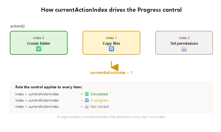
In Part 1, we built a completely static version of the Progress control: a fixed array of mocked actions and a currentActionIndex value hardcoded directly in the source code. That was intentional — it let us focus purely on understanding how the control derives each step’s visual state (completed, in progress, not started) from a single number, without any distraction from state management or user interaction.
Now it’s time to bring that number to life. In this part, currentActionIndex becomes a piece of React state, updated by a “Next step” button. This is the first step toward the real-world pattern where a sequence of actions progresses as work actually happens — even though, for now, nothing is really being “executed” yet (that comes in Part 3).
The conceptual shift
The core idea from Part 1 doesn’t change: the control still calculates each item’s visual state from currentActionIndex. What changes is who controls that number:
| Part 1 | Part 2 | |
|---|---|---|
Where currentActionIndex lives | Hardcoded constant | useState |
| What changes it | You, editing the source code | The user, clicking a button |
| Purpose | Observe the control’s rendering rules | Observe state-driven re-rendering |
This distinction matters because it’s the same mental model you’ll reuse in Part 3, just with a manual trigger (a button) instead of an automatic one (a real async action completing).
The code
import * as React from 'react';import { useState } from 'react';import { Progress, IProgressAction } from '@pnp/spfx-controls-react/lib/Progress';import { PrimaryButton } from '@fluentui/react';const ProgressControlWp: React.FC = () => { // MOCKED data: same fixed list of steps as Part 1 const mockActions: IProgressAction[] = [ { title: 'Create folder' } as IProgressAction, { title: 'Copy files' } as IProgressAction, { title: 'Set permissions' } as IProgressAction, ]; // NEW: currentActionIndex is now state, not a hardcoded value const [currentActionIndex, setCurrentActionIndex] = useState<number>(0); // Advances the "cursor" by one step, but never past the last action const goToNextStep = (): void => { setCurrentActionIndex((previousIndex) => { const isLastStep = previousIndex >= mockActions.length - 1; return isLastStep ? previousIndex : previousIndex + 1; }); }; // Resets the sequence back to the beginning const resetSteps = (): void => { setCurrentActionIndex(0); }; return ( <div> <Progress title={'Progress with manual state'} actions={mockActions} currentActionIndex={currentActionIndex} showOverallProgress={true} hideNotStartedActions={false} /> <PrimaryButton text="Next step" onClick={goToNextStep} style={{ marginRight: 8 }} /> <PrimaryButton text="Reset" onClick={resetSteps} /> </div> );};export default ProgressControlWp;
Breaking down the important decisions
useState<number>(0) as the starting point. Starting at 0 means “we’re on the first step” — not “nothing has started yet.” This is a subtle but important distinction: in this control’s model, there’s no built-in concept of “before step zero.” The first action is always considered in progress from the moment the component renders, unless you explicitly design your UI to hide that (which is exactly what hideNotStartedActions, covered in Part 4, is for).
The functional form of setState. Notice this line:
setCurrentActionIndex((previousIndex) => { ... });
instead of the more intuitive-looking:
setCurrentActionIndex(currentActionIndex + 1);
Both work correctly for a simple button click, but the functional form is the safer pattern in React: it guarantees you’re always working from the most up-to-date value of the state, rather than a value that might be “stale” if multiple updates happen in quick succession (for example, if the button were clicked rapidly, or if this logic later moved inside an async callback). It’s a small habit worth building early.
Guarding against overflow. The isLastStep check stops currentActionIndex from ever exceeding mockActions.length - 1. This is a deliberate difference from the Part 1 experiment, where we intentionally set currentActionIndex beyond the array’s bounds to observe how the control handles it. Here, since this is closer to a pattern you’d actually ship, we clamp the value instead of letting it overflow.
Why a separate resetSteps function. It’s not strictly required for understanding currentActionIndex, but it makes manual testing far more practical — without it, you’d have to reload the page every time you wanted to watch the sequence from the beginning.
Practical example: what to observe while testing
- Load the Web Part. The first action (“Create folder”) should already show as in progress (🔄), since
currentActionIndexstarts at0. - Click Next step repeatedly. Watch how each previous step flips to completed (✅) the moment a later step becomes the current one.
- Click Next step after reaching the last action (“Set permissions”). Nothing should change — this confirms the overflow guard is working.
- Click Reset. The sequence should jump back to the first action being in progress, with the other two back to not started (⬜).
If all four behaviors match, you’ve correctly internalized how currentActionIndex, as state, drives the entire visual output of the control.
Conclusion
The biggest takeaway from this part isn’t the useState hook itself — it’s confirming that the control’s rendering logic from Part 1 holds true regardless of where currentActionIndex comes from. Whether it’s a hardcoded number or a piece of live state updated by a button click, the control doesn’t care; it just recalculates the same way every time it re-renders. That consistency is exactly what makes Progress easy to plug into more complex, real-world workflows — which is where Part 3 picks up, replacing this manual button with actions that actually execute something (via a mocked, delayed execute() method), matching the pattern recommended by the official PnP documentation.
Summary table
| Topic | Short Description | Official Documentation Links |
|---|---|---|
Progress control | Renders the state of multiple sequentially executed actions; does not execute logic itself | https://pnp.github.io/sp-dev-fx-controls-react/controls/Progress/ |
IProgressAction | Interface describing each step; minimally requires a title | https://pnp.github.io/sp-dev-fx-controls-react/controls/Progress/ |
currentActionIndex | Number indicating which step is currently active; drives completed/in-progress/not-started calculation | https://pnp.github.io/sp-dev-fx-controls-react/controls/Progress/ |
useState | React hook used to hold and update currentActionIndex as real component state | https://react.dev/reference/react/useState |
Functional setState updates | Pattern (setValue(prev => ...)) that avoids stale-state bugs when updating based on the previous value | https://react.dev/reference/react/useState#updating-state-based-on-the-previous-state |
hideNotStartedActions | Required prop controlling whether not-started steps are shown or hidden; explored in depth in Part 4 | https://pnp.github.io/sp-dev-fx-controls-react/controls/Progress/ |
In Part 3, we’ll replace the manual “Next step” button with IProgressAction objects that implement a real execute() method — mocked with an artificial delay — matching the pattern the PnP documentation recommends for production use.
 edvaldo b. guimarães filho